Grand Continental
BEYOND THE DESTINATIONMINI BRAND IDENTITY
·
MINI BRAND IDENTITY ·
case studyGrand Continental
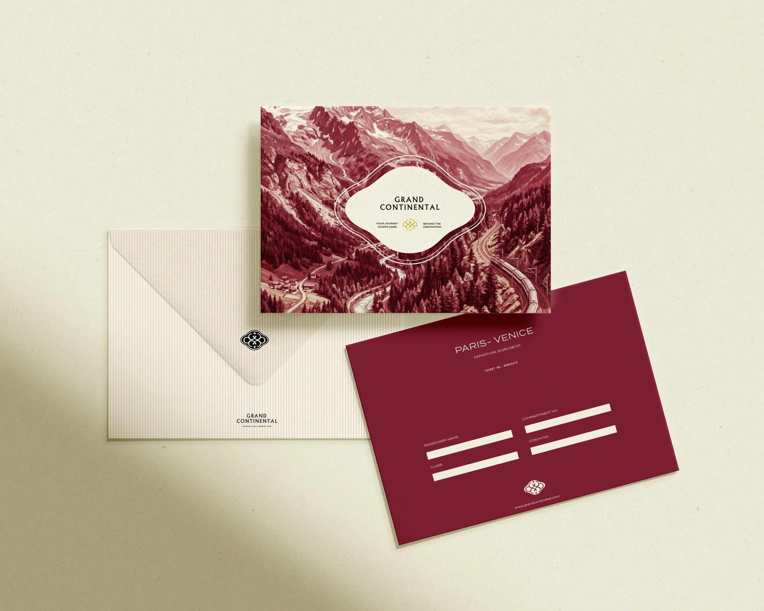
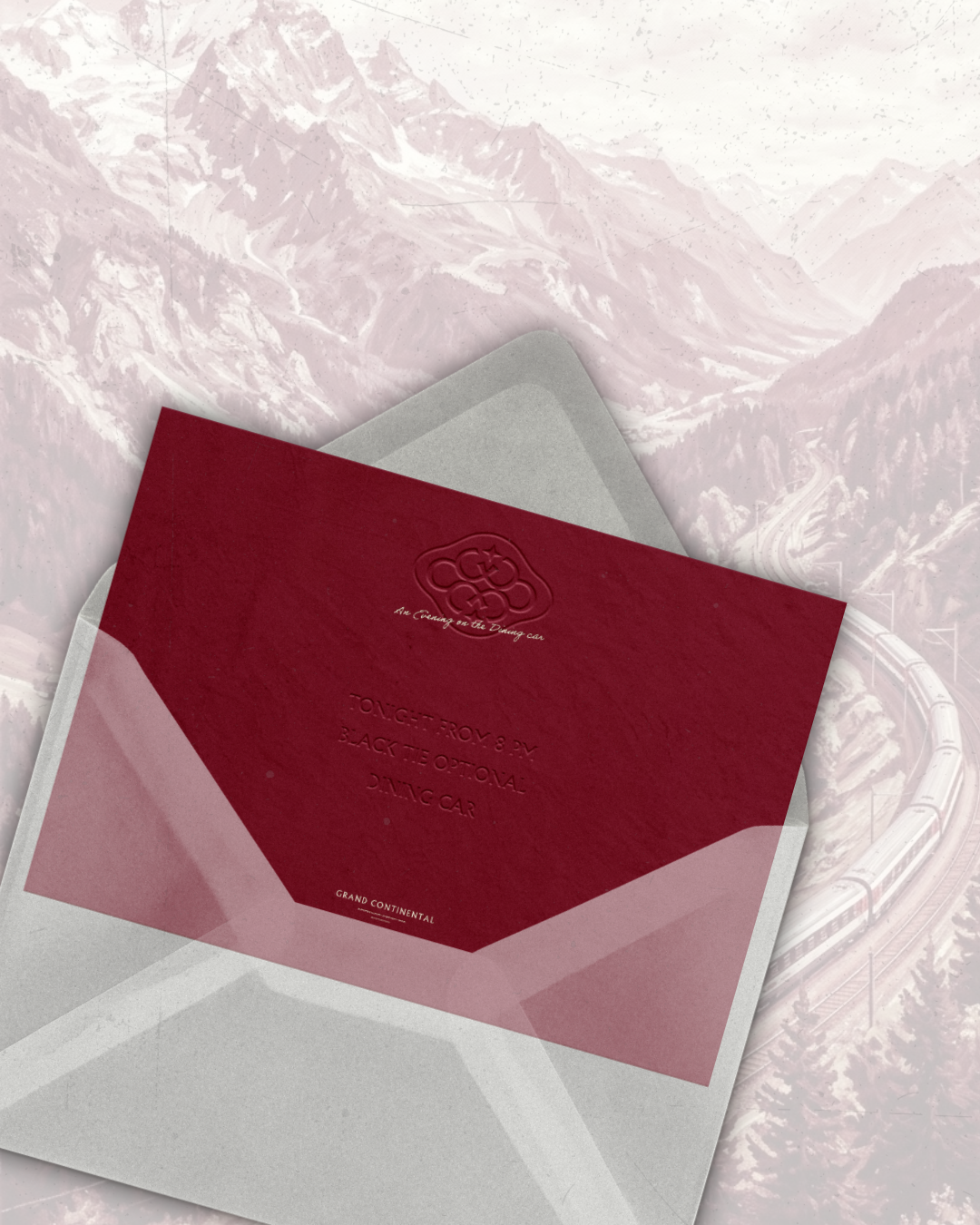
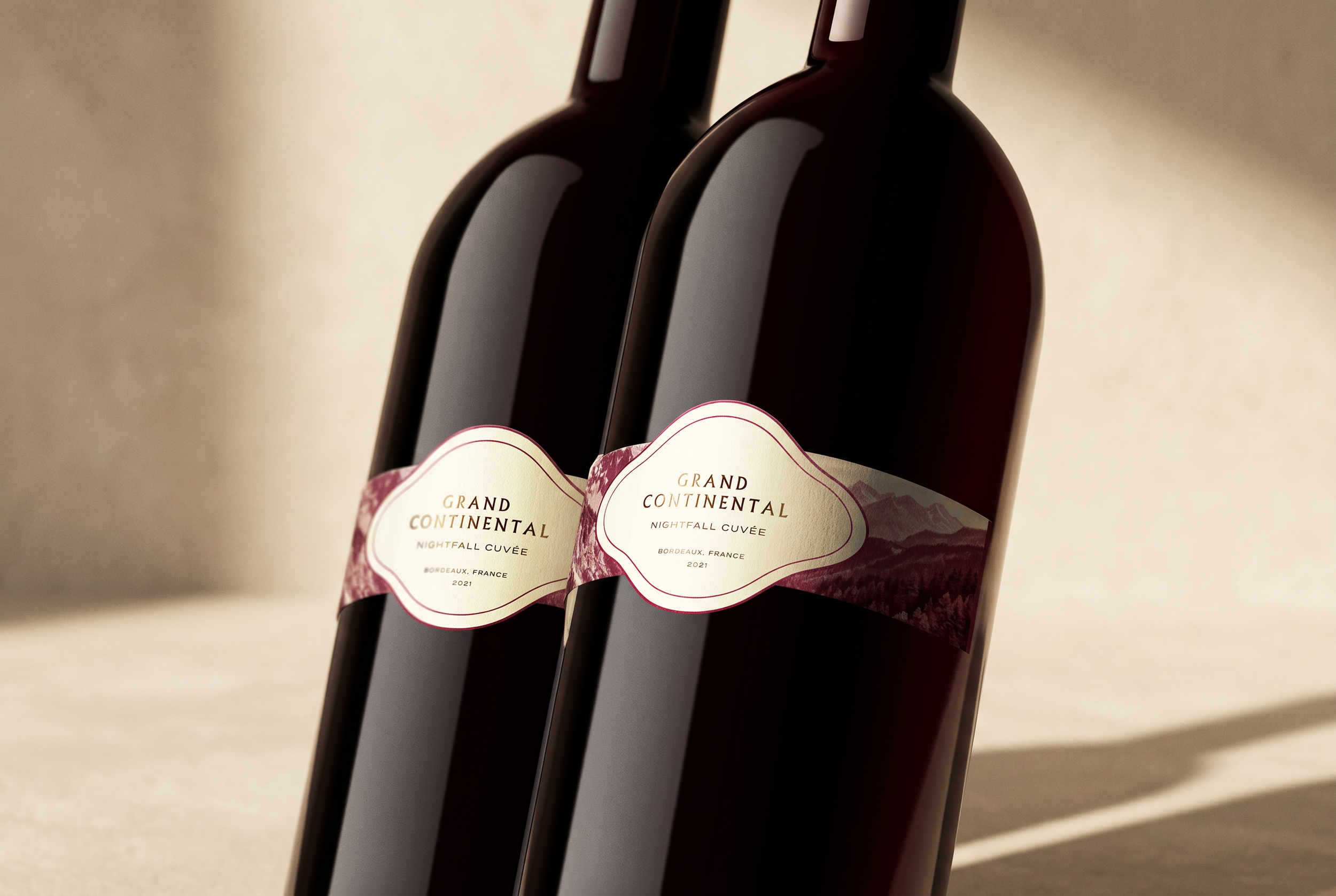
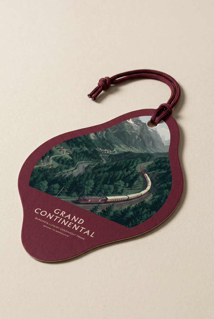
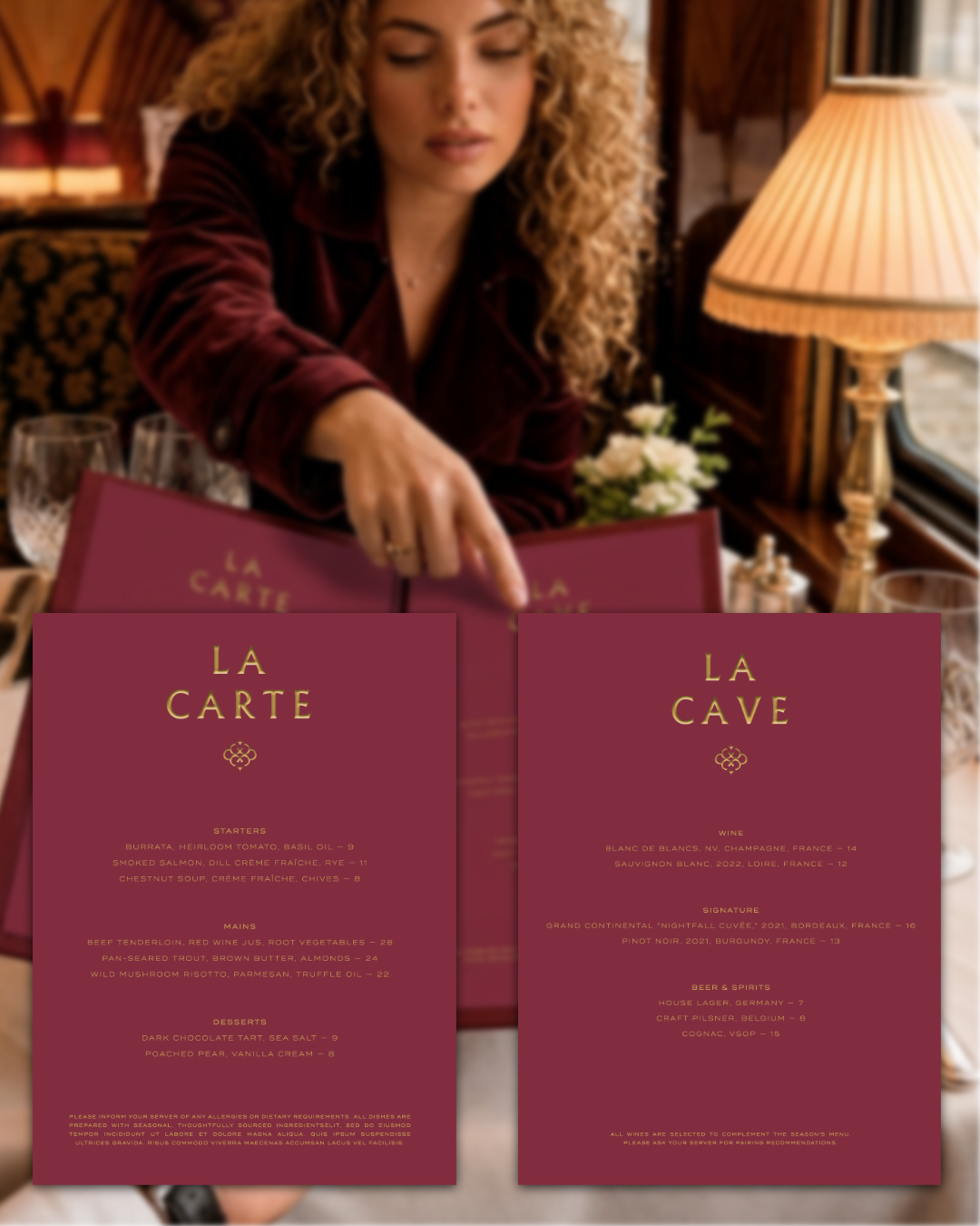
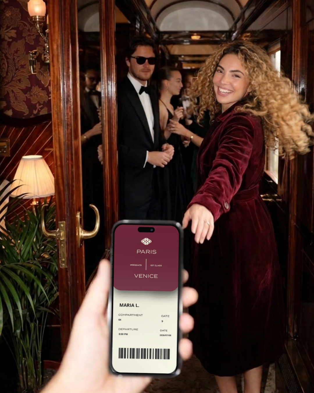
GRAND CONTINENTAL is a speculative brand identity project imagining a modern revival of the golden-age overnight train - a slow, deliberate alternative to the rush of contemporary travel. The concept spans visual identity, packaging, editorial photography direction, and brand voice, built around a single idea: that the journey deserves as much care as the destination.
There was a time when the journey mattered as much as the destination. Grand Continental was born from the belief that Europe is not a collection of cities, but a connected story waiting to be experienced at the pace it deserves.
As travel became faster, it also became something to endure rather than enjoy. Airports replaced grand stations, schedules replaced spontaneity, and the romance of crossing borders quietly disappeared. Grand Continental revives that forgotten ritual: every journey begins at dusk, unfolds through the night in complete comfort, and arrives by morning not simply in another city, but in another chapter of Europe.
The brand is positioned as more than an overnight train - a moving grand hotel, built for travelers who measure luxury in time, atmosphere, craftsmanship, and unforgettable moments.


Visual Identity
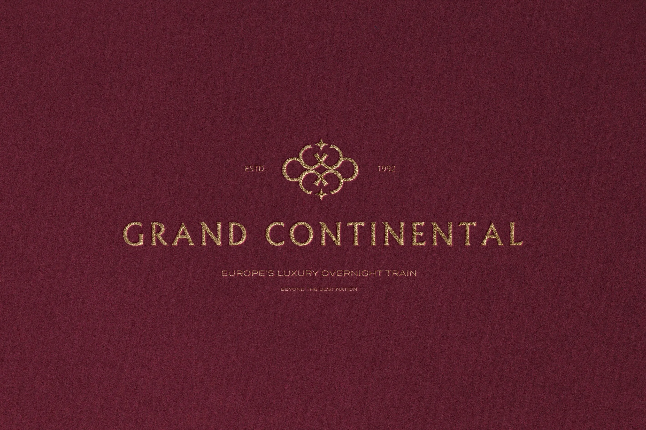
The emblem is built from the brand's own initials - four interlocking G's, from "Grand," and two C's, from "Continental," forming a symmetrical quatrefoil ornament in the tradition of classic luxury monograms. At each of its four points, a small star nods to the north star, a symbol of navigation and direction fitting for a brand built around crossing the continent.
Brand voice
Grand Continental's copy leans evocative rather than promotional - short, atmospheric lines built around the sensation of travel rather than its logistics. The voice avoids over-explaining, trusting mood and pacing to do the work: dusk, departure, unhurried dinners, a view that changes while you sleep.