

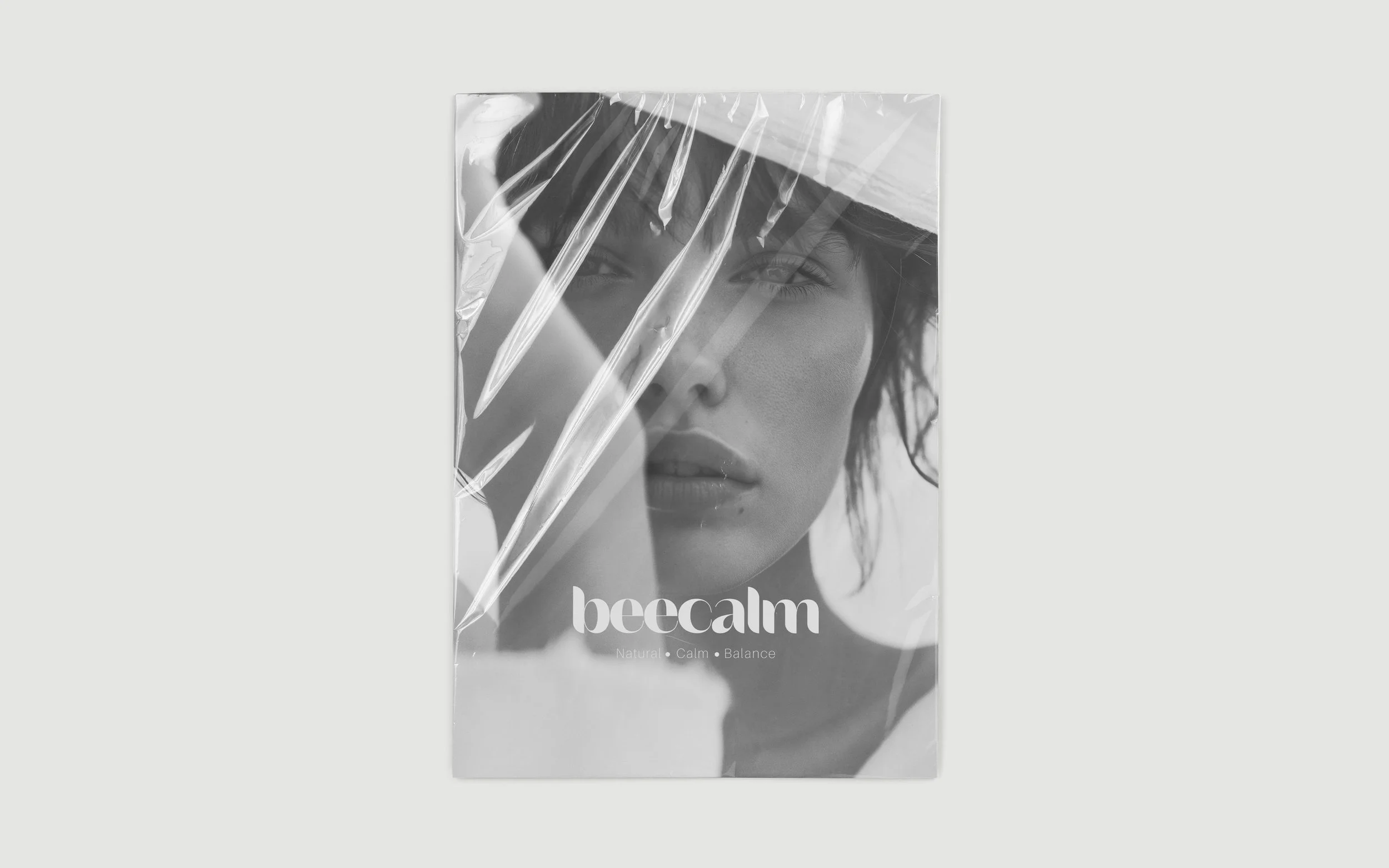
Beecalm
balance - the beecalm wayFULL BRAND IDENTITY
·
WEBSITE DESIGN
·
FULL BRAND IDENTITY · WEBSITE DESIGN ·
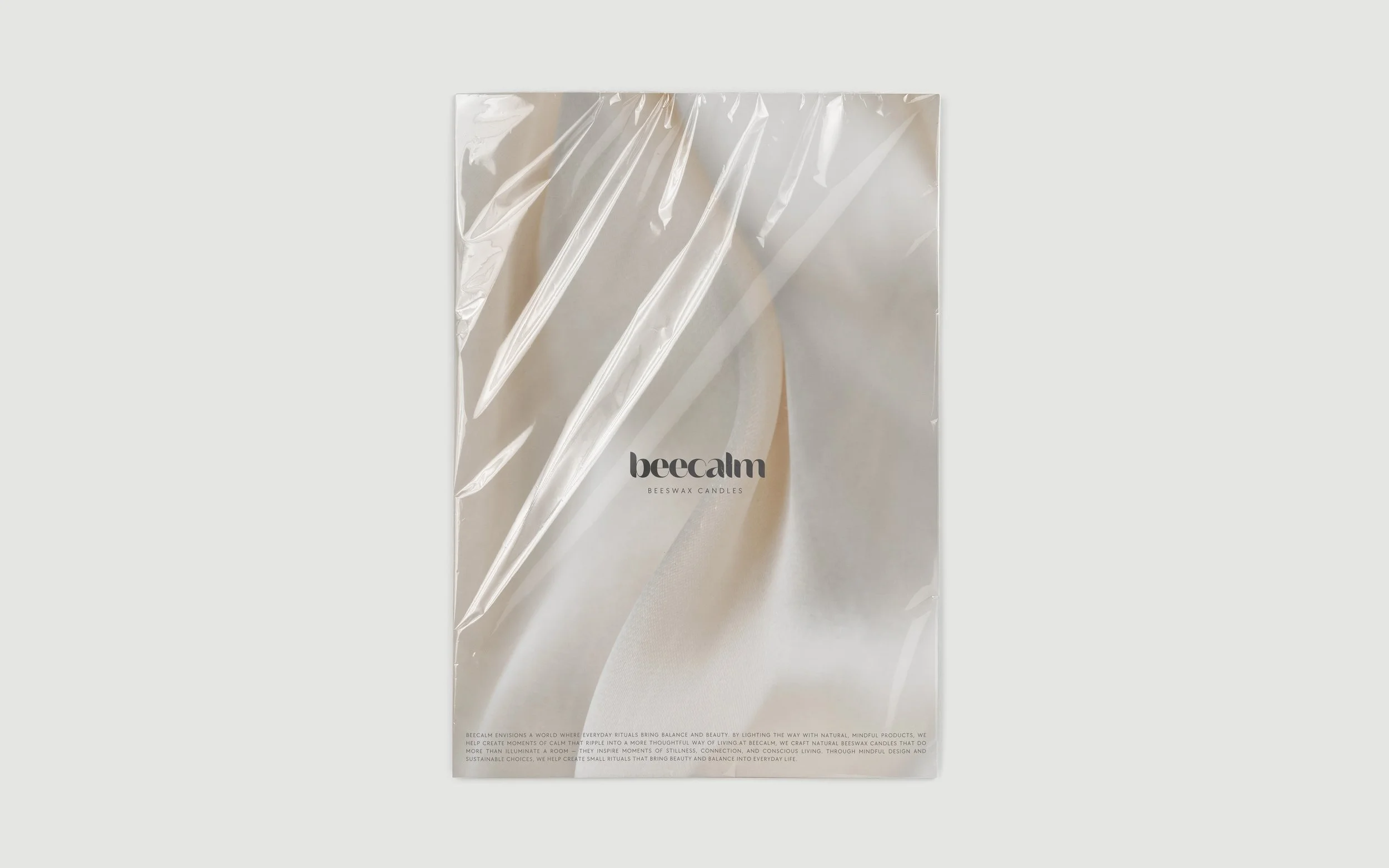
CASE STUDYBeecalm
Launching a new brand in the wellness space is never just about selling a product – it’s about creating a lifestyle people want to be part of. Beecalm, a small-batch beeswax candle brand, needed more than beautiful packaging. They needed an identity that felt calm, conscious, and trustworthy from the very first touchpoint.
Stepping into a crowded, trend-driven market, the challenge was clear: how to transform a simple product into an experience that would stand out and build loyalty. Beecalm wanted to be known not only for their sustainable materials and high quality, but for offering customers a sense of ease, warmth, and mindful living.
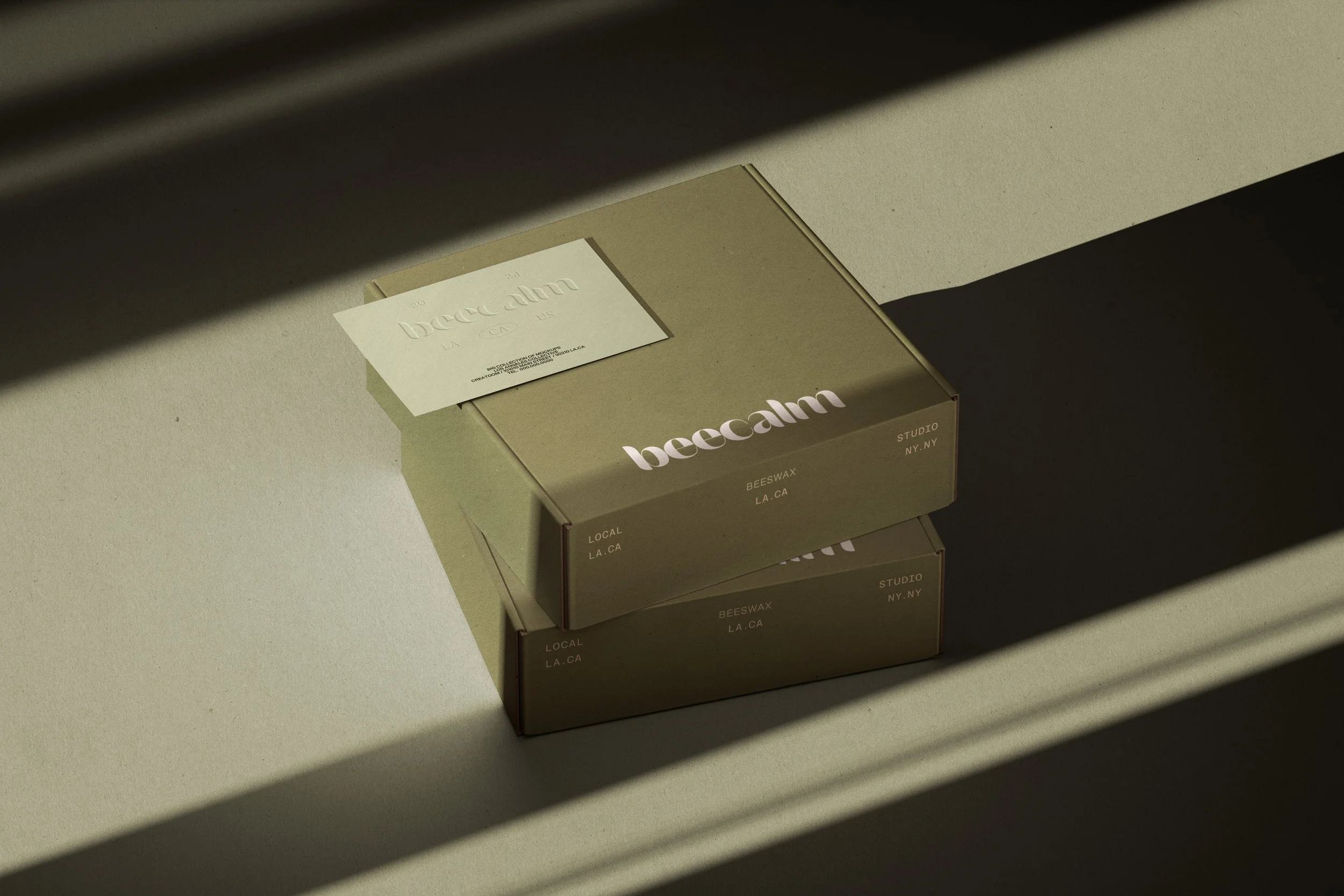
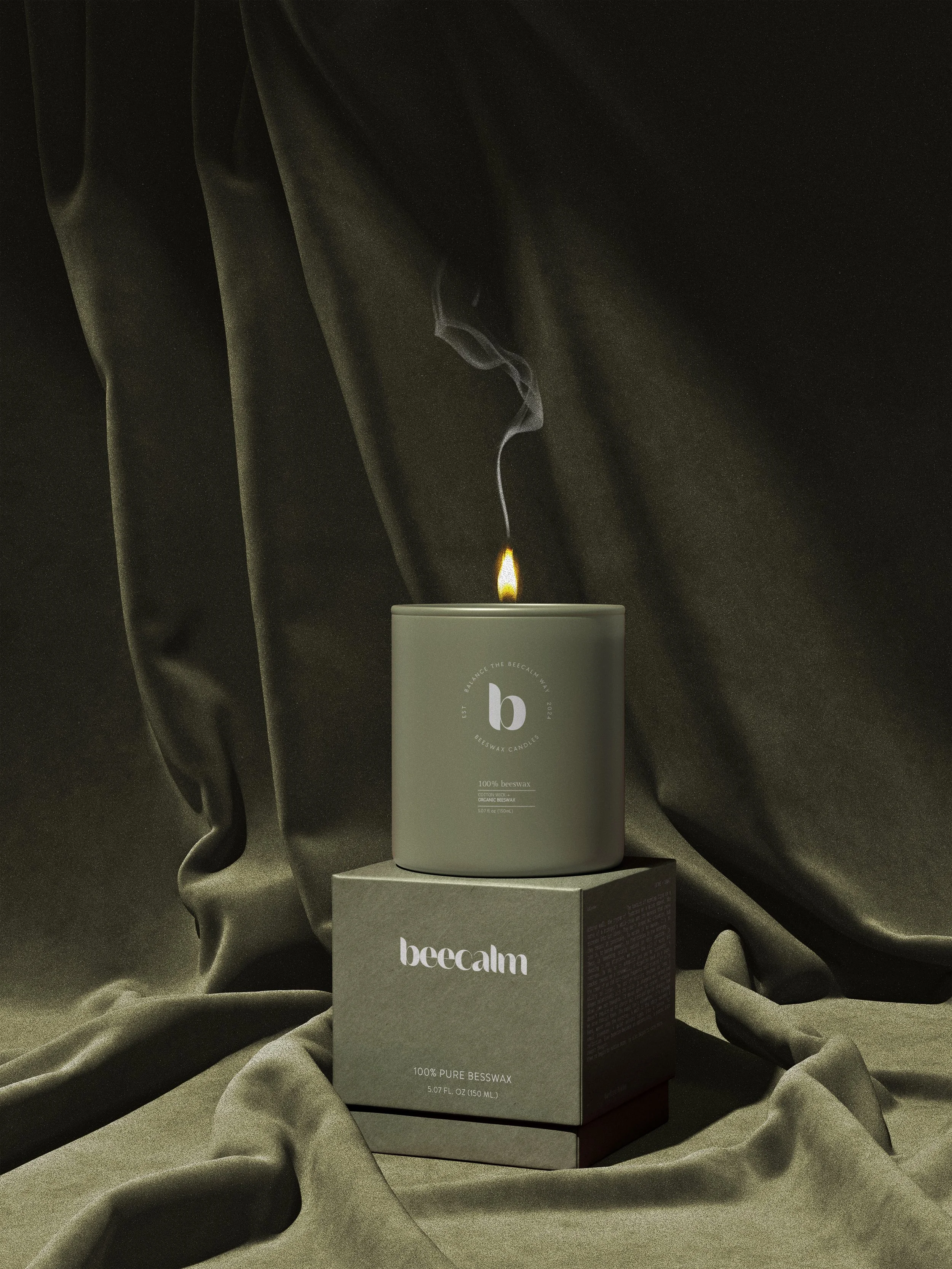
We set out to create a brand rooted in authenticity and simplicity. From color palette to typography, every detail was designed to signal calm, warmth, and trust. The brand narrative emphasized conscious choices and quiet luxury, ensuring Beecalm would feel both approachable and premium. Beyond the visuals, we crafted a tone of voice and guidelines that allowed for consistent communication across packaging, social media, and digital presence.
The result was a cohesive identity that positioned Beecalm as more than just another candle company. With a timeless wordmark, soothing neutral tones, nature-inspired details, and packaging that balanced sustainability with elegance, Beecalm gained the clarity and tools they needed to grow organically while staying true to their roots.
In their words: