Making Memories
Come as guests to your own weddingMINI BRAND IDENTITY
·
WEBSITE DESIGN
·
MINI BRAND IDENTITY · WEBSITE DESIGN ·
CASE STUDYMaking Memories
Making Memories already had an established identity and a loyal client base - but the brand had outgrown its visual expression. The brief wasn't to start from scratch, but to do something harder: evolve and refine without losing the soul.
The Challenge
Modernising a brand that already works requires precision. Too much change and it no longer feels like Making Memories. Too little and nothing really shifts.
What We Did
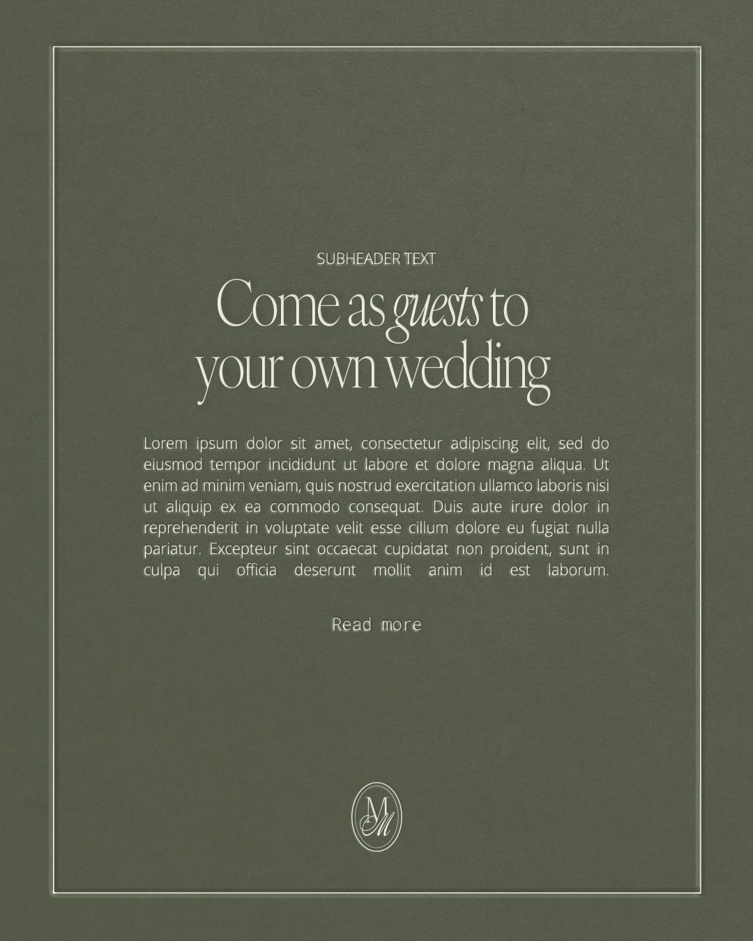
We started with brand strategy to understand the core; her values, her voice and where she wants to take her business. From that foundation, we created a new visual identity inspired by an old money aesthetic, but without the cold, editorial distance that often comes with it.
The result is refined and timeless, yet warm and deeply personal. A logo with multiple variations, a carefully curated colour palette and a typography system that feels both elegant and approachable.
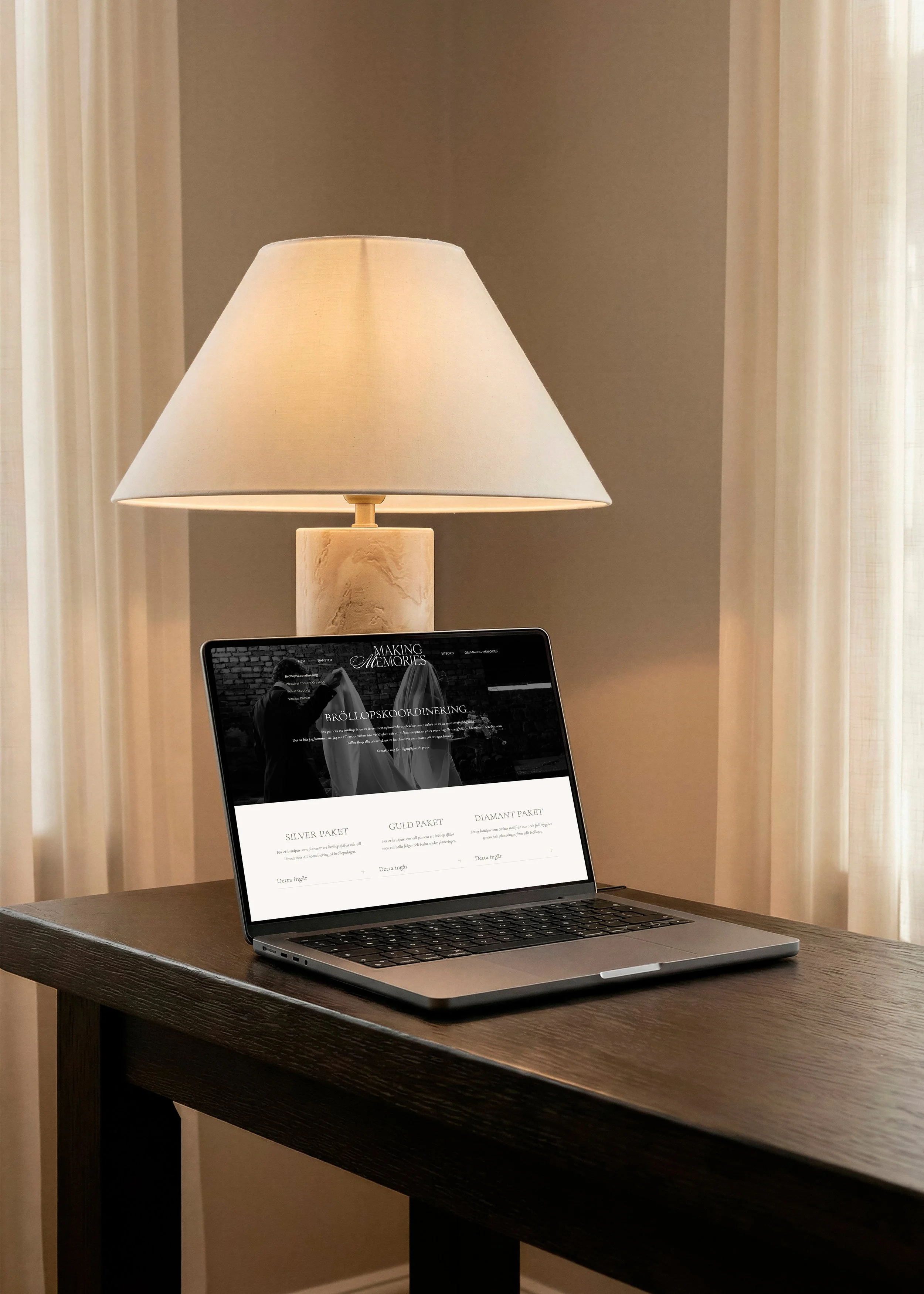
The identity was then implemented directly into her existing WordPress website, with targeted adjustments and improvements that elevate both the professionalism and the user experience.
The end result
Making Memories 2.0 - same brand, same warmth, but with a visual expression that reflects where she is today and where she's headed.
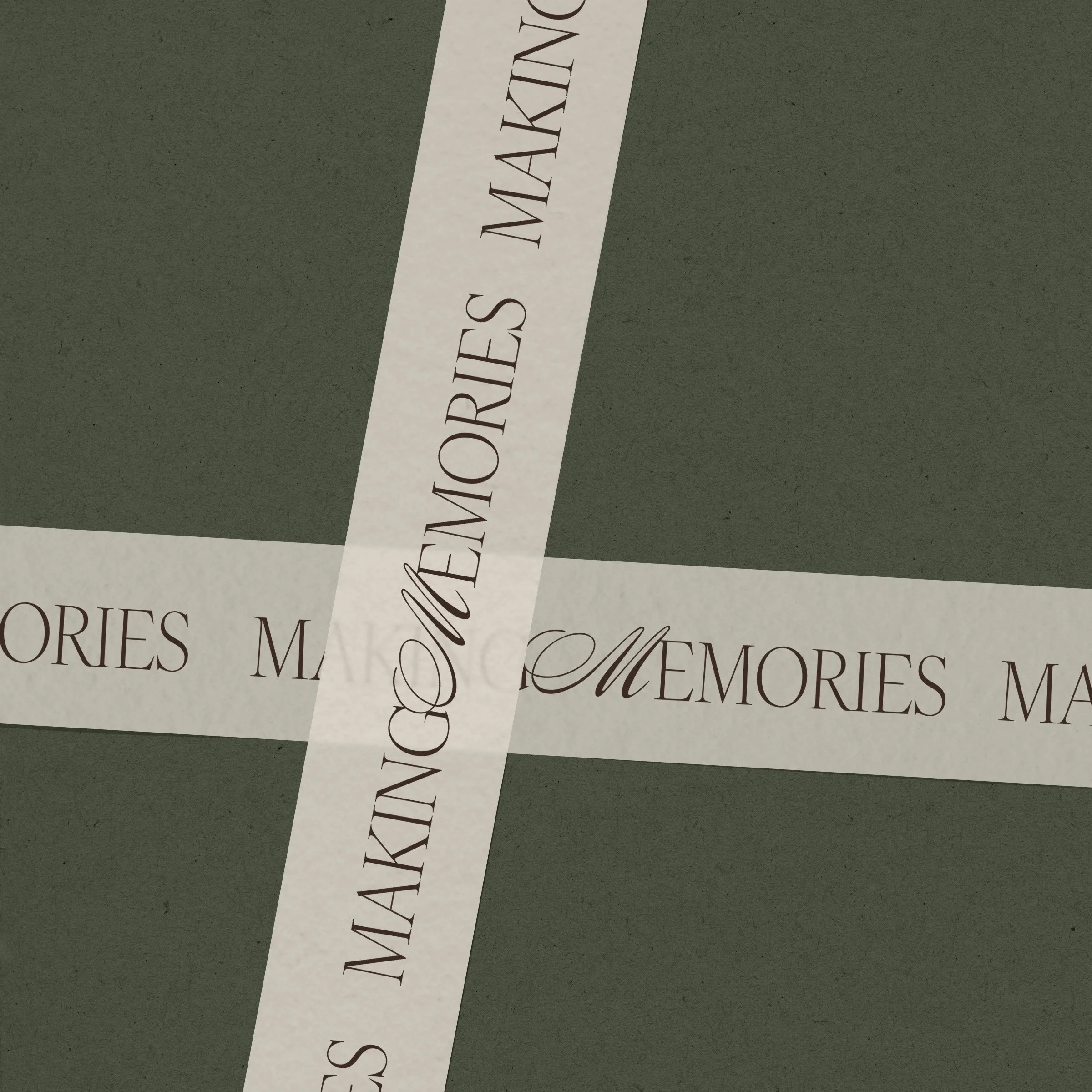
Colour
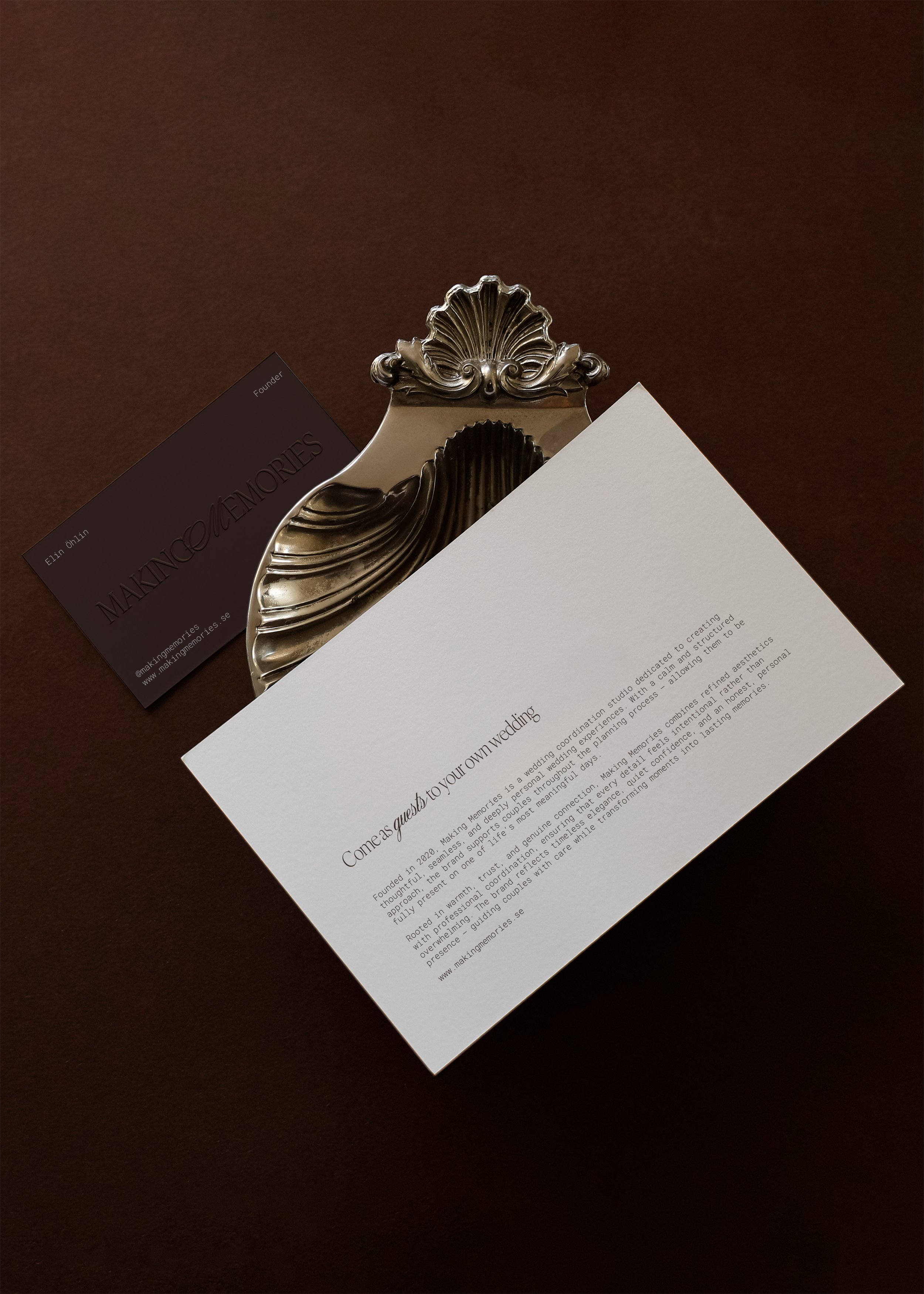
The palette was built around materials, places and sensations connected to meaningful gatherings and European countryside weddings. Ivory inspired by natural linen, candlelight and handwritten invitations, forms the foundation, creating softness and openness. Espresso brings depth and timeless confidence, grounding the brand with a quiet old money character. Taupe acts as a bridge between the two, ensuring harmony across all applications. Charcoal Olive add a natural, grounded quality, echoing moss-covered stone walls and olive trees.
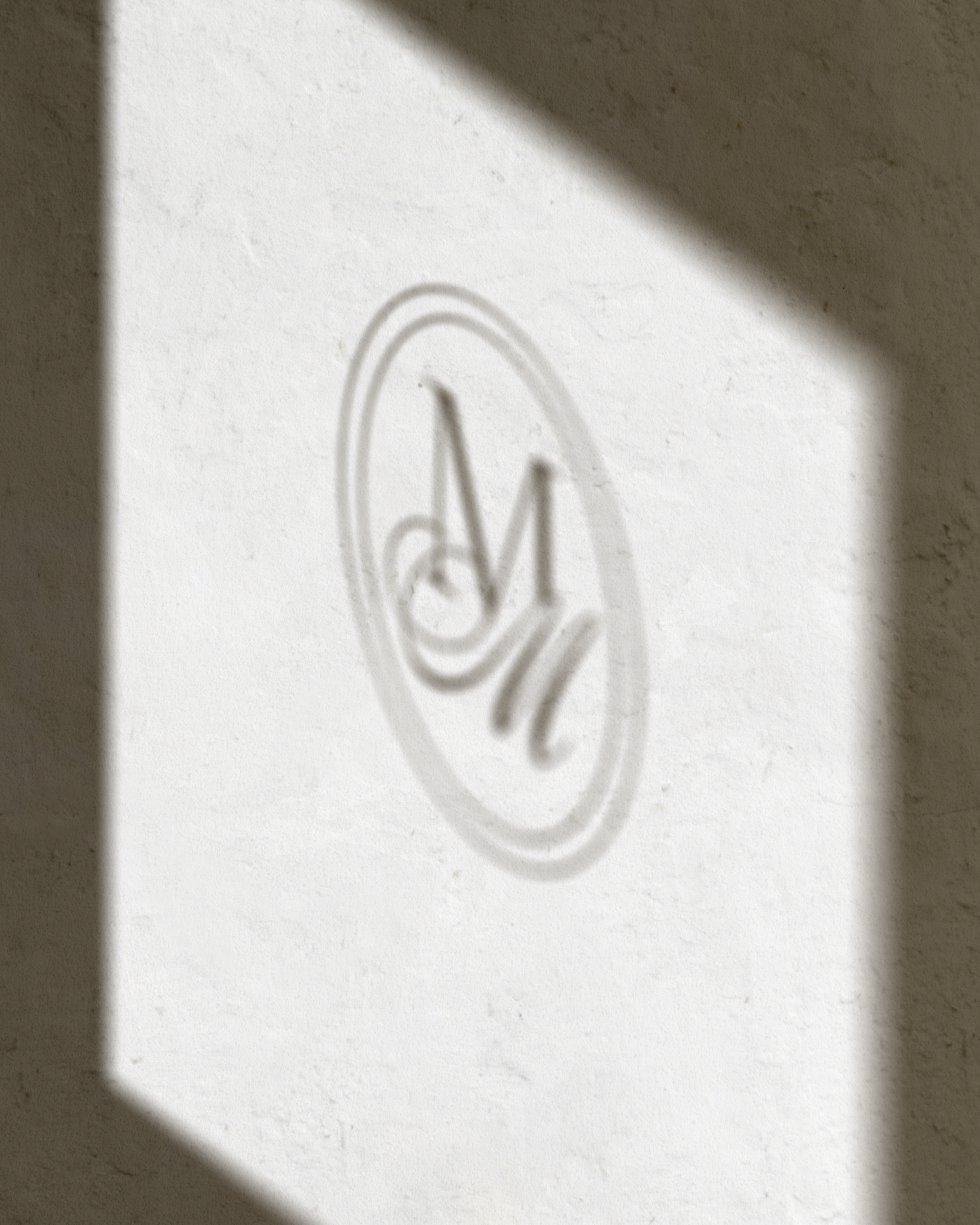
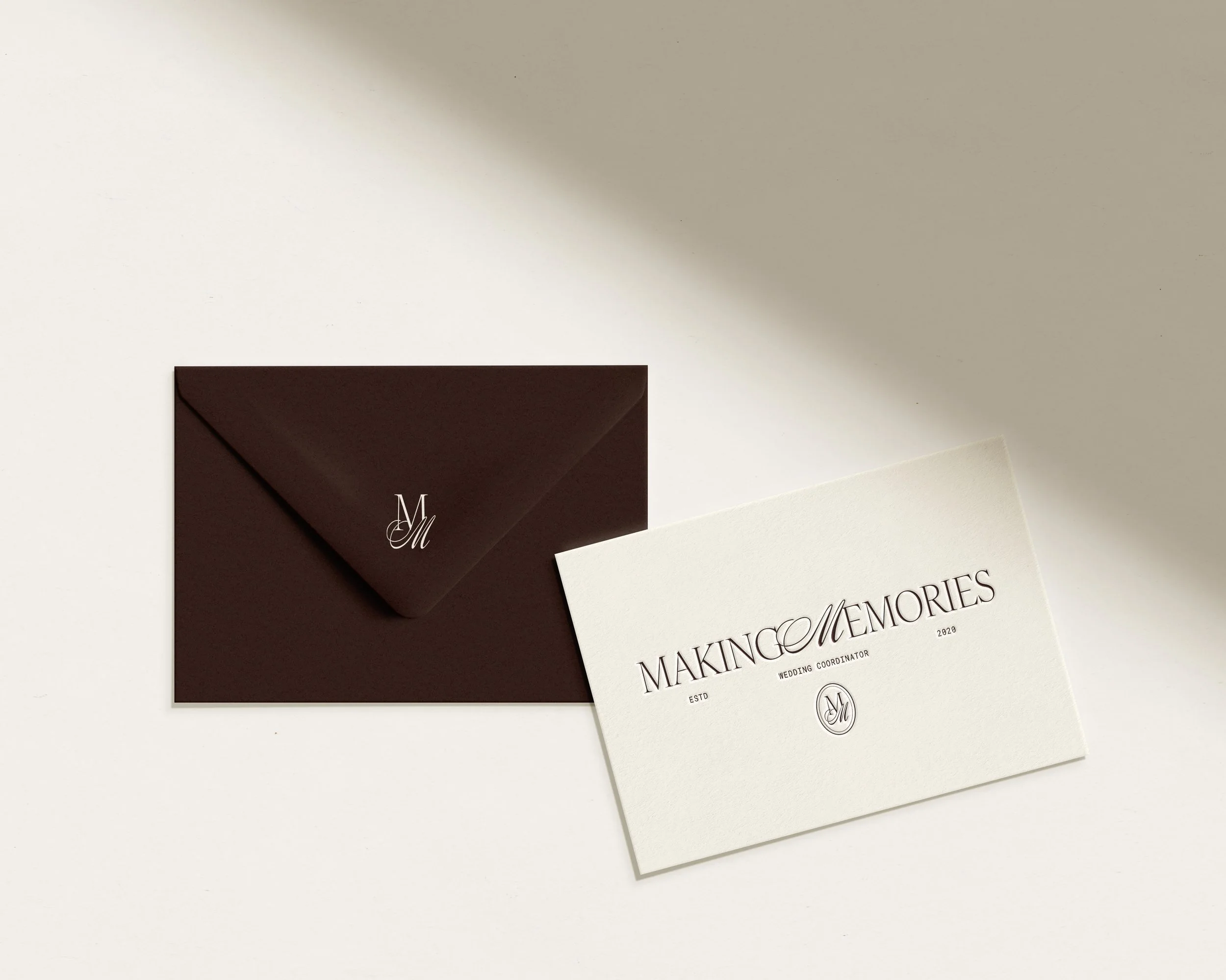
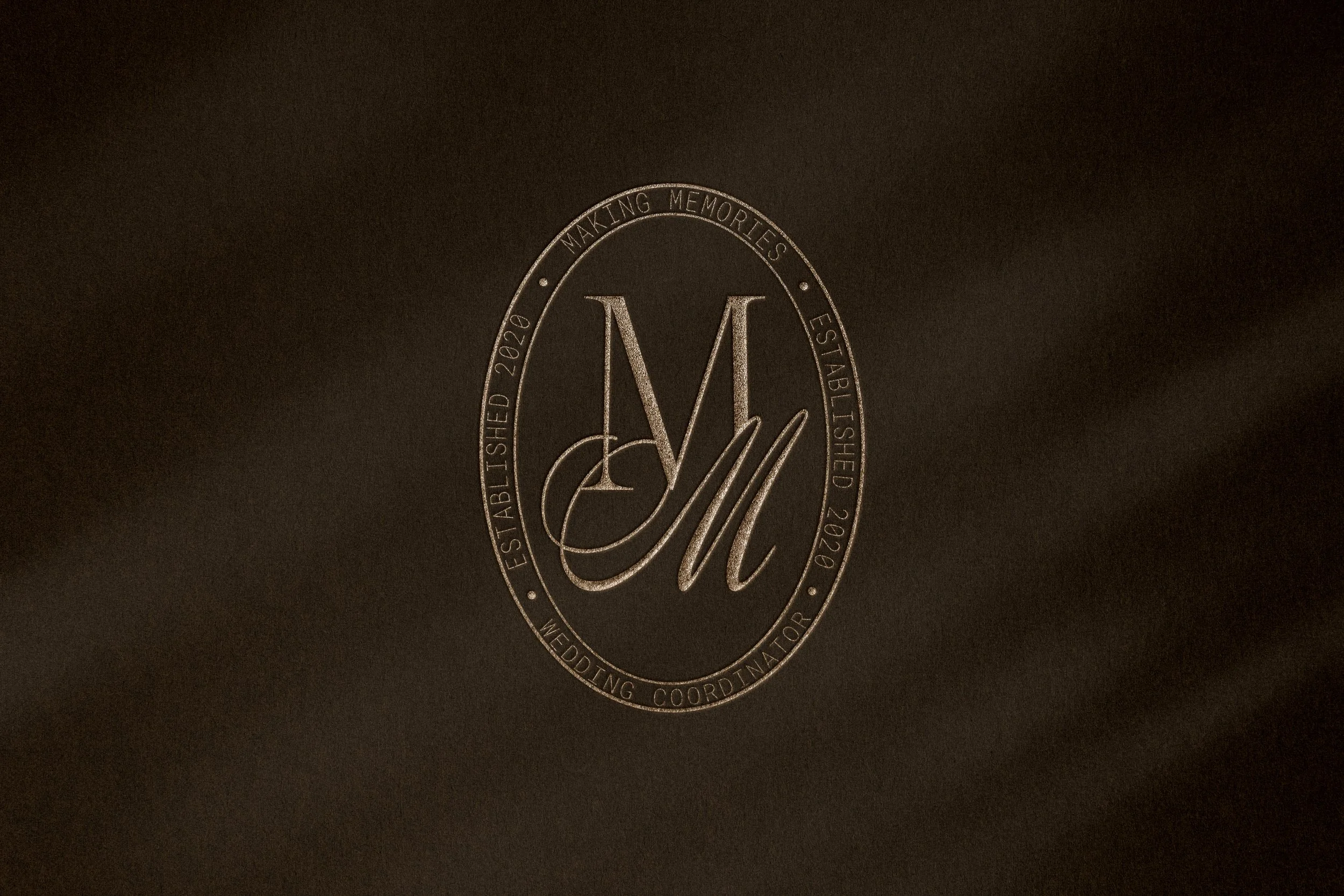
Logo
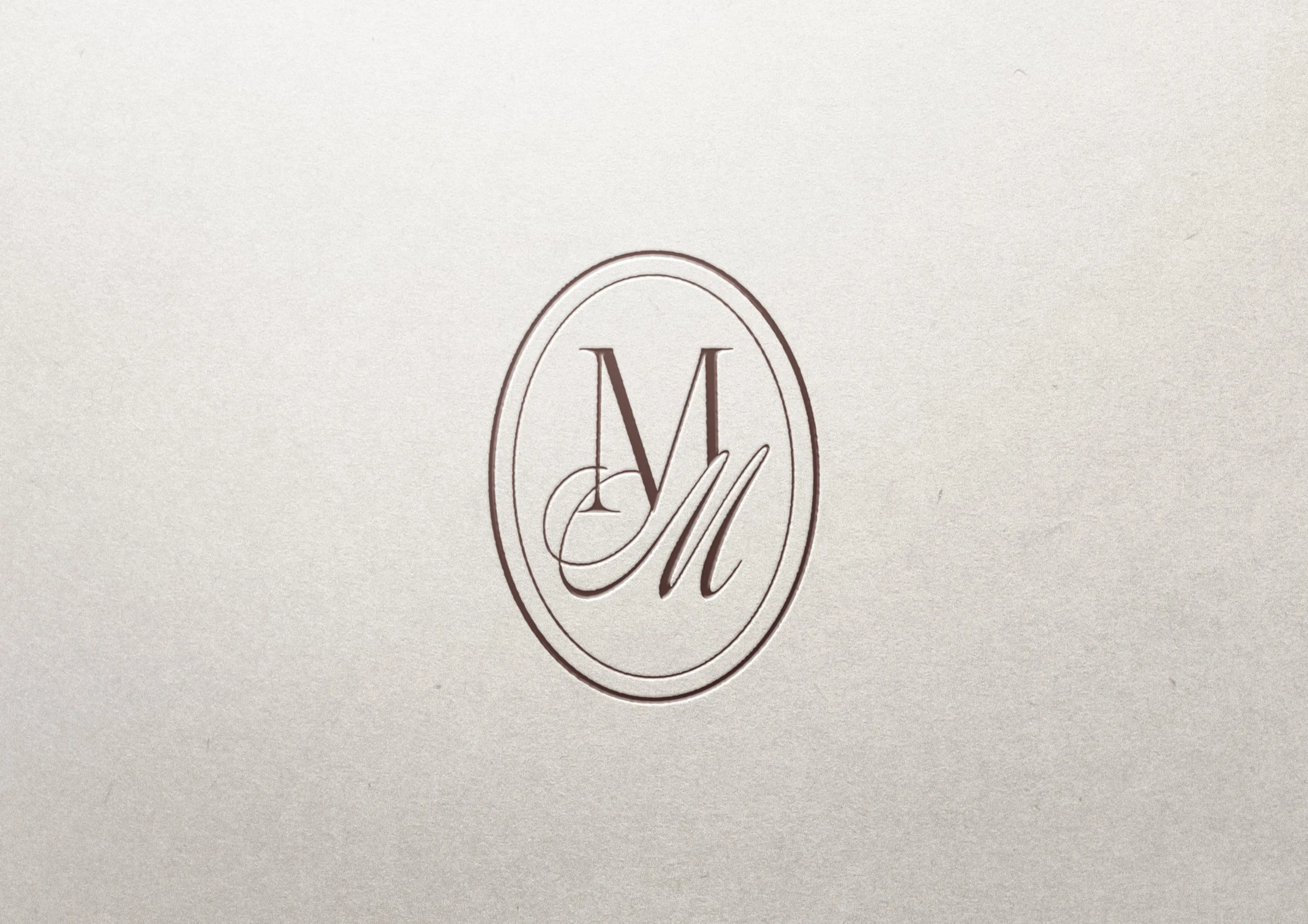
The logo was designed to carry the full weight of the brand across every touchpoint. The primary wordmark combines a refined serif with a flowing script M, creating a tension between structure and elegance that feels both classic and personal. Multiple variations were developed: a horizontal version for wide formats, a stacked version for vertical and square spaces, and monogram submarks for moments where the full wordmark won't fit - watermarks, wax seals, social media icons etc. Every variation was built to feel intentional, not like an afterthought.